Thursday, September 20, 2012

Universal truths. (4)

More Than Five Stars by Elif Uras 2003.  More Than Five Stars gives a viewpoint of leading up.  The bright colors make the painting inviting and warm.  The multiple layer of each room show show a different depth perception concept. With each floor the scenery changes allowing the viewer to determine if a spiritual level is reached considering the  higher the level the more bright and clear the images on the the top floor are.  The multicolored floors are reminiscent of the Catholic Churches stained glass windows minus the religious images which give the painting the religious aspect.


Beauty is in the eye of beholder.

Madonna Jaguar collage on wood was created in 1998 by Larry Qualls.  This collage has a unique quality in it presentation.  The name Madonna is normally viewed as religious. While I see a person in the collage others may not.  The feature are not well defined but depending on the view you may see certain images.  The collage has a certain texture and beauty to it.  While there is a lack of color the curved lines give the image a soft feel which does contrast with the deep, dark colors used.  There is also a sadness in the image with the way the persons mouth is portrayed.


Elavating to a whole nother level. (3)
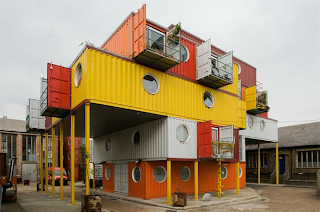


Container City  by Nicholas Lacey and partners in 2002.  This building located in London, England so a more useful look at space.  Not only is this art form visually appealing due to the use of color but also functional. The colors compliment each other and stand out in the bland setting showing this architectural wonder..  The numerous floors and odd length of the floor design maximize square footage.  Each section of the building has it own patio for everyone to view form a different perspective of the surrounding city.  The larger third floor of structure also serves a as parking/ drive thru area.

Madonna-her visual "record" (2)


True Blue the poster to promote Madonna's third album in 1986 also became the cover of the album.  This image captures a time in early pop culture when fans of pop music were waiting to see what new image the "material girl" came out with.  Madonna was known to reinvent her image with each new album since her debut of self titled Madonna.  This poster is significant by showing a more refined look and the singers comparison to Marilyn Monroe.  This new image also started its very own fashion trend.  With platinum blonde hair, dark eyebrows and lite makeup, Madonna showed that less is more 


A new view of water. (1)

Seascape by Mike and Doug Stam (Stam Twins) This photo was exhibited in the Stux gallery in Spring 1988.  The ripples in the waves give the two dimensional photo a three dimensional quality.  The lighting chosen show s different view of the normal blue inviting waves by appearing as black against white drops shows texture. The color of black normally shows a void of color but by contrasting the deep dark waves against texture.  The lines in the photo give each section its own perspective and view which in turn give life to the photo as a whole.


Kitsch


Made of handmade pottery, Joseph Enterprises has created the ultimate Kitsch! SpongeBob sitting with grass growing from is head is a classic.  This Chia SpongeBob represents the good humor and funny nature of this iconic character.  With his wide smile you can not help but smile of even laugh a little.  The makers captured every detail to bring a cartoon character to "life".  This is a creation that is not only pleasing to the eye but also brings us life in the the form of a plant.